This post is a bit out of the scope of this blog, but I think it has important implications for making sure our students develop solid critical thinking skills.
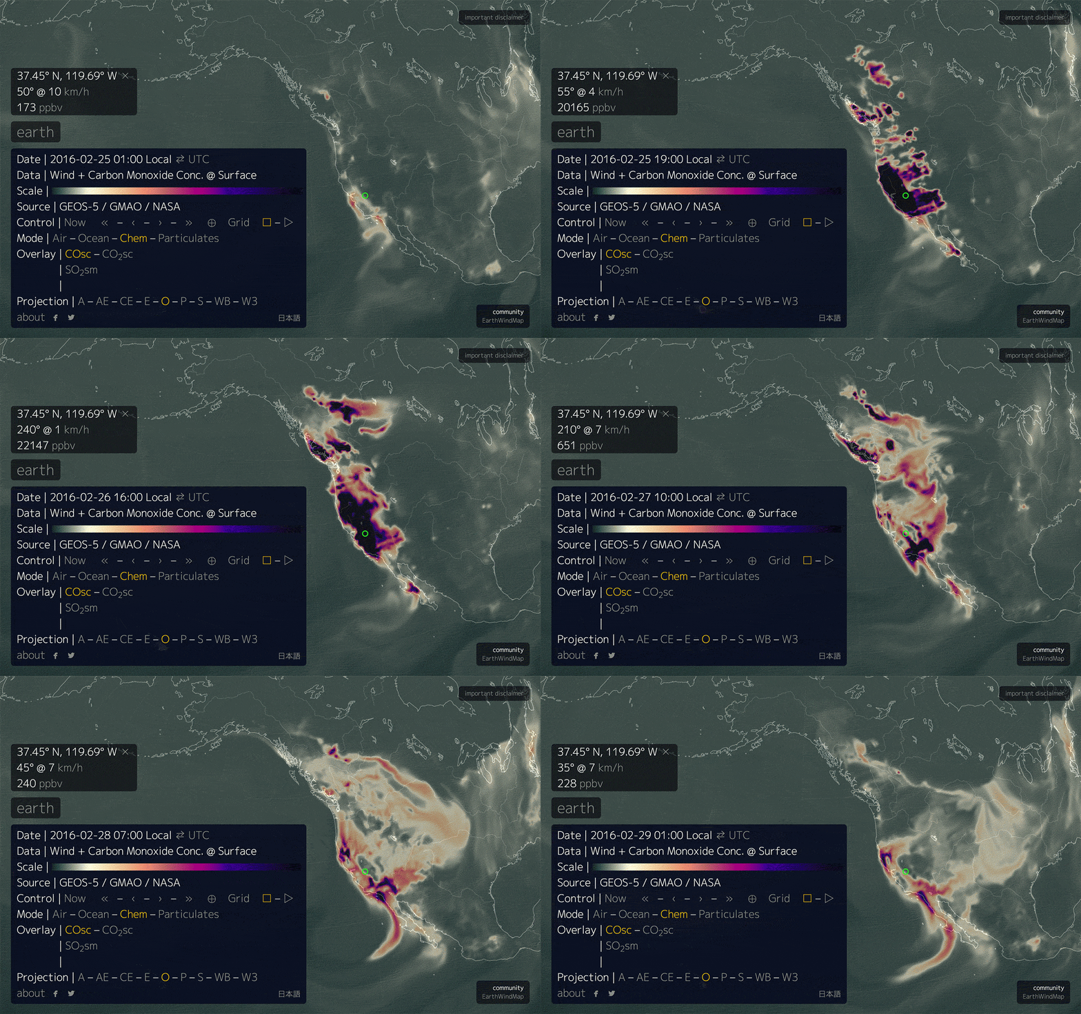
A few days ago, people began noticing an apparent eruption of carbon monoxide (CO) in western North America as seen on Cameron Beccario’s excellent animated map of global weather conditions: Earth. If you view the carbon monoxide data on the map, it shows what appears to be a huge emission of CO beginning in the afternoon of February 25th. In some places, CO levels apparently reach 40,000 ppb (parts per billion), whereas normal levels usually range somewhere between 100 – 1000 ppb.

Loop of surface CO concentrations Feb 25, 2016 through Feb 28, 2016. Based on images from earth.nullschool.net.
The internet has been in a tizzy over the over the possibility that this sudden and dramatic output of CO, as well as CO2 and SO2, signifies that a large earthquake is imminent on the west coast. The basis for these claims is a paper that appeared in the journal Applied Geochemistry authored by Dr. Ramesh Singh titled, “Satellite detection of carbon monoxide emission prior to the Gujarat earthquake of 26 January 2001.” Most of the blogs have been linking to this page on NatureIndia.com.
I’ve read the journal paper, and it’s claims are questionable at best. However the merits of the paper are irrelevant because there was no major gas emission on February 25th.
For some reason, no one seems to be questioning the data upon when Nullschool.net’s Earth map is based. Stuff happens and sometimes, though not often, scientific instruments can malfunction. The map even has a disclaimer link at the top right of the screen warning not to take the data too seriously. Clicking on it leads to the statement,
GEOS-5 data (covering all Chem and Particulates layers) comes with the following disclaimer: Forecasts using the GEOS system are experimental and are produced for research purposes only. Use of these forecasts for purposes other than research is not recommended.
This should give anyone pause before scaring people into believing that a destructive earthquake is imminent. After a few hours of research, here’s what I was able to find out about the data used in Nullschool.net’s Earth map.
Source of carbon monoxide data
Earth’s options menu show the source of the data displayed by the map. For the surface-level carbon monoxide overlay, Earth uses data from GEOS-5. GEOS-5 is a system of models that NASA designed to simulate our planet’s climate variability over many different lengths of time.
NASA’s Global Modeling and Assimilation Office (GMAO) says that the GEOS-5 atmospheric model uses data collected by the MOPITT and AIRS instruments. The MOPITT (Measurement of Pollution in the Troposphere) instrument resides on Terra, a satellite that NASA launched in 1999. Terra is the same satellite that collects the MODIS data often featured in spectacular fashion on NASA’s Earth Observatory site. AIRS (Atmospheric Infrared Sounder) was launched on the Aqua satellite in 2002.
So the best I can tell, the MOPITT and AIRS instruments are the primary sources for the CO surface data seen in the Earth map, as well as the CO2 surface and SO2 surface mass data. I wouldn’t be surprised if data from ground-based instruments is also being used by GEOS-5, but I haven’t been able to determine that yet from my research.
MOPITT data outage
University of Wisconsin-Madison’s Space Science and Engineering Center has a timeline of Terra’s system status and it reports that on February 18th, the Terra satellite went into safe mode. All of the satellite’s instruments stopped collecting data, including MOPITT. Terra resumed scientific data collection late in the day on February 24th. Data began being broadcast sometime on the 25th, but they note on the 26th that instrument operating temperatures are still stabilizing, affecting the data collected using infrared channels.
MOPITT uses light collected in the infrared part of the spectrum. Based on Terra’s system status, the CO, CO2 and SO2 data collected by MOPITT on the 25th and 26th of February should be highly suspect.
On the Earth map, the CO, CO2, and SO2 levels spike sometime between 1pm and 4pm Pacific time on Feb. 25th, which is between 2100 UTC on the 25th and 0000 UTC on the 26th. This is precisely during the time window when MOPITT’s operating temperature is still unstable.
This leads to the conclusion that the dramatic increase in CO, CO2 and SO2 levels observed on February 25th isn’t due to any naturally occurring phenomenon. It’s a result of GEOS-5 models incorporating newly acquired data that was faulty.
Location of the gas increases
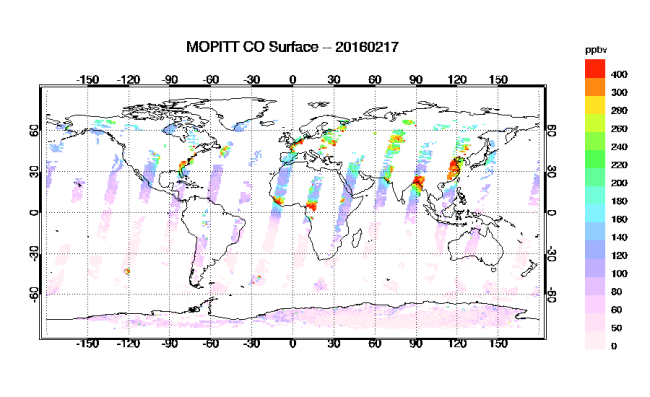
It’s reasonable to question that if the data is faulty, why are the apparent gas increases showing up only on the west coast of North America? Why aren’t there big gas spikes all over the world? The answer lies in how the MOPITT collects data. The Terra satellite is in a polar orbit, meaning it circles the earth over the north and south poles and across the equator. As it moves above the earth, MOPITT collects its data in swaths about 640 km (400 miles) wide. It takes almost three days to cover the entire earth.
Factor in cloud cover and it’s pretty easy to see from the daily plot above that MOPITT data is sparse. You can view the data here.
It’s pure coincidence that at MOPITT resumed data collection over western North America while its operating temperature was still stabilizing. Had the instrument’s temperature remained unstable for a few days, it would have looked like the whole globe was erupting gas. If MOPITT has started collecting data over the south pole, open ocean, or some other obscure location, I doubt anyone would have noticed and made a big fuss.
Don’t forget the AIRS data
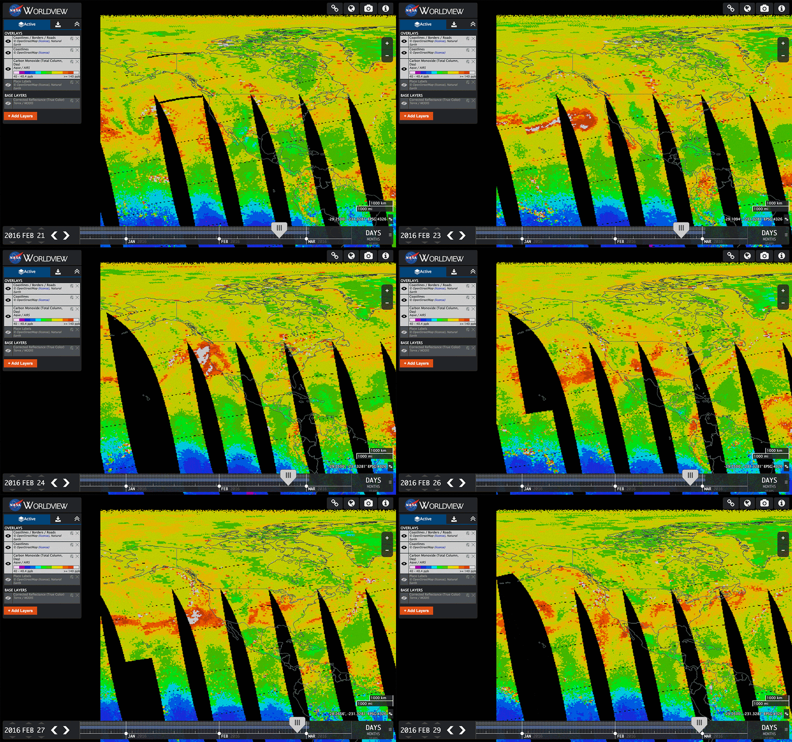
Remember that MOPITT isn’t the only satellite-based instrument being used to collect carbon monoxide concentration data. The AIRS instrument on Aqua was also collecting data during the same time period in question, and there were no reported issues with the instrument or satellite. See the loop below.
There is no huge gas plume. Note the color scale tops out at 140 ppb (parts per billion). Compare this to the 40,000 ppb levels seen on Nullschool.net’s Earth map during the heigh of the apparent gas eruption. After the GEOS-5 model combines the data, the magnitude of the bad MOPITT data is so large that it simply overwhelms the accurate data collected by AIRS.
You can view and interact with the AIRS data for yourself here.
Good lesson for students
So is there a dangerous earthquake about to hit somewhere on the west coast of North America? The truth is, we don’t know. The nature of the tectonically active west coast means the possibility is always there, and the USGS has done its best to quantify the probability of future earthquakes.
However, the chance of a major earthquake striking the west coast has not changed in the past week. There are no scientific models that can reliably predict earthquakes, especially based on carbon monoxide emissions. More importantly, there was no sudden spike in carbon monoxide emissions, natural or otherwise.
This would make a good exercise for high school (and maybe middle school) teachers to give their students. Sudden and dramatic changes in observed data should always be questioned and the causes investigated. Machine and human error should be eliminated as possible cause first. Only when one is confident the data is sound and reliable can he or she begin the fun part of using the scientific method to find the true cause of observed phenomena.
Update: GMAO has put out a statement confirming that bad CO data points erroneously created the unrealistically high levels of CO in the GEOS-5 data products.


Thanks for the great explanation of this very interesting event that didn’t actually happen!
No harm, no foul, no earthquake.
Thanks Greg. I first heard about it when someone posted the link to Robert’s blog on WeatherWest.com. When I checked out Nullschool’s map my first thought was, “No way that’s real.” Amazing how much attention it’s getting.
Excellent offering, thank you.
Thanks for the kind words Chris.
Thanks Bryan,
I caught this in an anti-climate sceptic Facebook group and thought immediately, can’t be real. People asked around and soon it was fact checked.
But your input explains it the best.
Thanks Aarne. I appreciate the compliment.
Why are posted replies beginning at 7:50pm – 9:04pm
What is your location?
Hi Tracy. I hadn’t properly the timezone in my WordPress settings. Fixed now. Thanks for the catch.
So then why did Europe’s Copernicus system get the same reading?
Link to C-IFS Forecast
I suspect that Copernicus is simply downloading the publicly available GEOS-5 data, just as Nullschool.net does, and incorporating it into the model.
I suspect Copernicus is simple downloading the public GEOS-5 data, just like Nullschool.net, and incorporating it into its own model.
Aren’t the Copernicus numbers showing vastly lower numbers? The “plume” shape seems the same, but the numbers are in the 4digit ppb, not the 5digit ppb geos-5 showed. Maybe I’m just misreading.
http://atmosphere.copernicus.eu/cams-input-data
does show MOPPIT amongs its input data.
Hi Karen,
It could be that Copernicus uses different equations to handle the CO data. However I notice from your link (thank you), that Copernicus also uses CO data from IASI. If GEOS-5 doens’t use IASI, then that might explain the difference.
Copernicus uses the same satellite for CO.
Thanks for the confirmation Julius!
It was interesting to be a part of the Twitter discussion to figure out what had happened. A lot of people were blaming a great website, earth.nullschool.net. In fact, the problem was with the errors in the emissions input fields to the NASA GEOS-5 model runs, which supply the CO fields to Nullschool. Not sure why it’s taken so long to fix the error in the GEOS-5 simulations. I’ve been impressed by the level-headedness of many people to look into the true cause of what was happening.
Exactly. You can also see the data contamination on GMAO’s 2D ChemMaps page. Once the data goes in to GEOS-5, it just blindly crunches away. That’s why they have their disclaimer about it being experimental and not to use it for anything other than research purposes. There’s so much data coming in so fast, that it’s probably a pretty big job to scrub the bad data.
sure your explanation could be legitimate. However I highly doubt that it really is. If it was reading the data falsely then it makes your whole systems program suspect. You have given no real explanation to dispute the facts in regards to the medical problems that people were having at the time that this outbreak apparently occurred. So if this is just as you explain, a matter of new programming reading information falsely, then the medical problems that apparently occurred at the same time are false also. Please explain how that is. I’m not a scientist, I’m just a simple farmer. The thing is, I do know that if it stinks, its probably manure. If I see something that some supposedly people who are in the know say something could be up. I like to say I trust their say so. If someone says its not. I expect a real explanation.
You, sir, are a thinking man.
Also, Nasa’s explanation contains circular reasoning:
Erroneous CO emissions over California cause unrealistic CO concentration in GEOS-5 model
March 1, 2016
“IMPORTANT NOTICE: Elevated carbon monoxide (CO) concentrations over California in the GEOS-5 products since February 25, 2016, are incorrect. They are a consequence of unrealistic emissions derived from satellite observations of fires, which led to elevated concentrations of atmospheric CO (as well as other species).”
So: “The erroneous emissions were caused by unrealistic emissions.”
http://gmao.gsfc.nasa.gov/news/geos_system_news/2016/incorrect_CO_concentrations.php
The obvious question is that if their measurements were thrown off by “observations of fires,” why weren’t they thrown off everywhere where there were fires? Why just along fault lines? Why is this explanation simply accepted by scientists because it comes from an authority?
grs, I agree that the GMAO statement was awkwardly worded. However, as I say in the article above, the location was limited to western North America because that’s just happened to be where MOPITT began recording data when its operating temperature was still unstable.
Thanks for your response, but tell me, why did the plumes of gas occur right along the fault lines? Just a coincidence? That’s absurd.
Bryan can you reply to
This question about the faults
@grs First of all, there were no plumes of gas. What we observed on Nullschool’s Earth map isn’t real. Even if it were real, then to which faults are you referring? The west coast of North America is criss-crossed with faults. The data, incorrect as it may be, does not have the spatial resolution to be associated with any fault with any degree of accuracy.
David, the system wasn’t reading the data falsely. Erroneous data was being feed into the model’s computational algorithms because of problems with the satellite’s instruments. That’s a big difference. Once the MOPITT’s operating temperature is stable, it will resume making correct measurements of carbon monoxide, as designed.
I am not disputing any medical claims being made by others. Frankly, I haven’t even looked into that angle. As a former scientist, I have to rely on objective and quantifiable instrument-based data. Medical reports are not a reliable method of documenting gas concentrations because there are too many factors that go into someone’s health.
Regardless, there was no eruption of CO, CO2 or SO2. The AIRS instrument on the Aqua satellite has been operating normally and saw no abnormal increases in gas concentrations.
That said, if you or others you know are experiencing medical problems, I do wish all well and hope for a speedy recovery.
A very persuasive post. I’m curious if you have a way of explaining the simultaneous CO burst over Mauna Loa that occurred synchronously with the supposed erroneous north-south swath over the West Coast. I also find it curious that the initial image of the CO burst over California seemed to align perfectly with the two fault lines up its east and west sides. Can you explain its accidental shape matching? The other strange thing was in the NASA forecast you linked to. It claims the incorrect imagery is “a consequence of unrealistic emissions derived from satellite observations of fires.” I’ve found zero evidence of any wild fires in California currently.(http://cdfdata.fire.ca.gov/incidents/incidents_current) How do you explain this? The BS meter seems to be climbing by the minute.
Kilauea, to the southeast of Mauna Loa, is a very active volcano right now. Intermittent bursts of CO, CO2, and SO2 seem pretty normal to me.
Regarding faults, to which specific faults are you referring? Really, though it’s irrelevant. There was no anomalous release of CO anywhere along the west coast.
The GMAO statement released by NASA doesn’t specify wildfires. Controlled burns in wilderness areas, or agricultural burns of old orchard trees would also qualify.
I believe the NASA explanation is that the instrument is used/designed for using fire observations to predict CO levels. Not that it was observing fires, but that the temperature instability made it *think* it was observing (big!) fires, and predicted/estimated very high CO levels… when what it was seeing was infrared that was actually from its detection elements being hot.
I believe you’re right Karen. Bravo!
So why are the European atmosphere monitoring satellites picking up the same CO anomaly?
http://macc.copernicus-atmosphere.eu/d/services/gac/nrt/nrt_fields!Carbon%20monoxide!Surface!54!Global!macc!od!enfo!nrt_fields!2016022600!!/
Because they use the same data.
http://atmosphere.copernicus.eu/cams-input-data
Hi Laskaris,
Copernicus also uses the same GEOS-5 data in its modeling algorithm as Nullschool’s Earth map.
Edit: Karen beat me to it. Nice!
Is there a way to check the current GOES-5 computer’s status? Would love to know if the plume I’m seeing over LA right now is just another anomaly. Or, if this happens in the future (massive plume) would be helpful to have a link to the current system status on GOES-5. That way we can cross ref CamBeck’s site with the source of the animations.
Just figured out the spelling error in my post and lack of search results. GOES-5 should be GEOS-5.
Great, instructive article and excellent information in the comments! Thanks a lot!
Thanks for the feedback, Nemesis.
Hey, thank YOU for your great job!
Interesting statement from Professor Ramesh Singh (who did the paper about carbon monoxide and an earthquake in India in 2001):
“ Chapman University Professor Ramesh Singh says it is not linked to an imminent earthquake.
He says he unknowingly got involved in the inaccurate claim because of an article he published years ago. The professor analyzed a spike in carbon monoxide just before a quake in India in 2001, killing thousands of people.
But he says that study has nothing to do with the image of elevated carbon monoxide in the U.S. this year.
“I said: ‘Hey what people are doing?’ They are digging out my paper, they are relating this, and the whole public is getting scared,” Singh says.”
http://losangeles.cbslocal.com/2016/03/03/nasa-satellite-image-with-claims-of-imminent-quake-triggers-scare/
Yeah, it’s too bad. None of this is Singh’s fault. While his observation of increased CO before that Indian quake may simply be a coincidence, it’s still a valid observation. It may be the only observation like it that will ever by made, or may be the first of many to come. At any rate, it’s an honest and genuine contribution to our civilization’s search for truth. That alone makes it noble.